Art Direction & Graphic Design Studio based in Spain. We develop identities and creative direction for clients from different fields.
From the studio and in collaboration with other creatives we seek to find their essence in order to create a unique voice and a particular language for each project, adding value and power to brands.
From strategy to the final output, we create solutions that are both conceptually and visually rich.
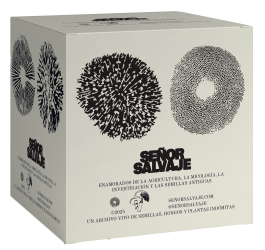
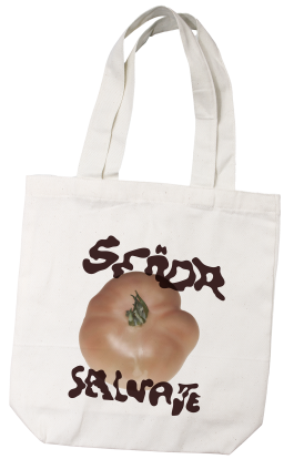
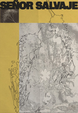
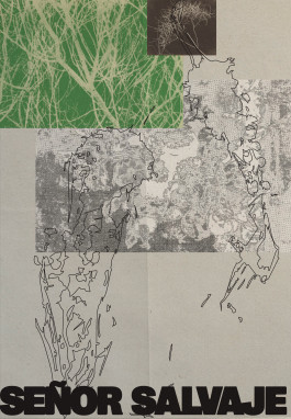
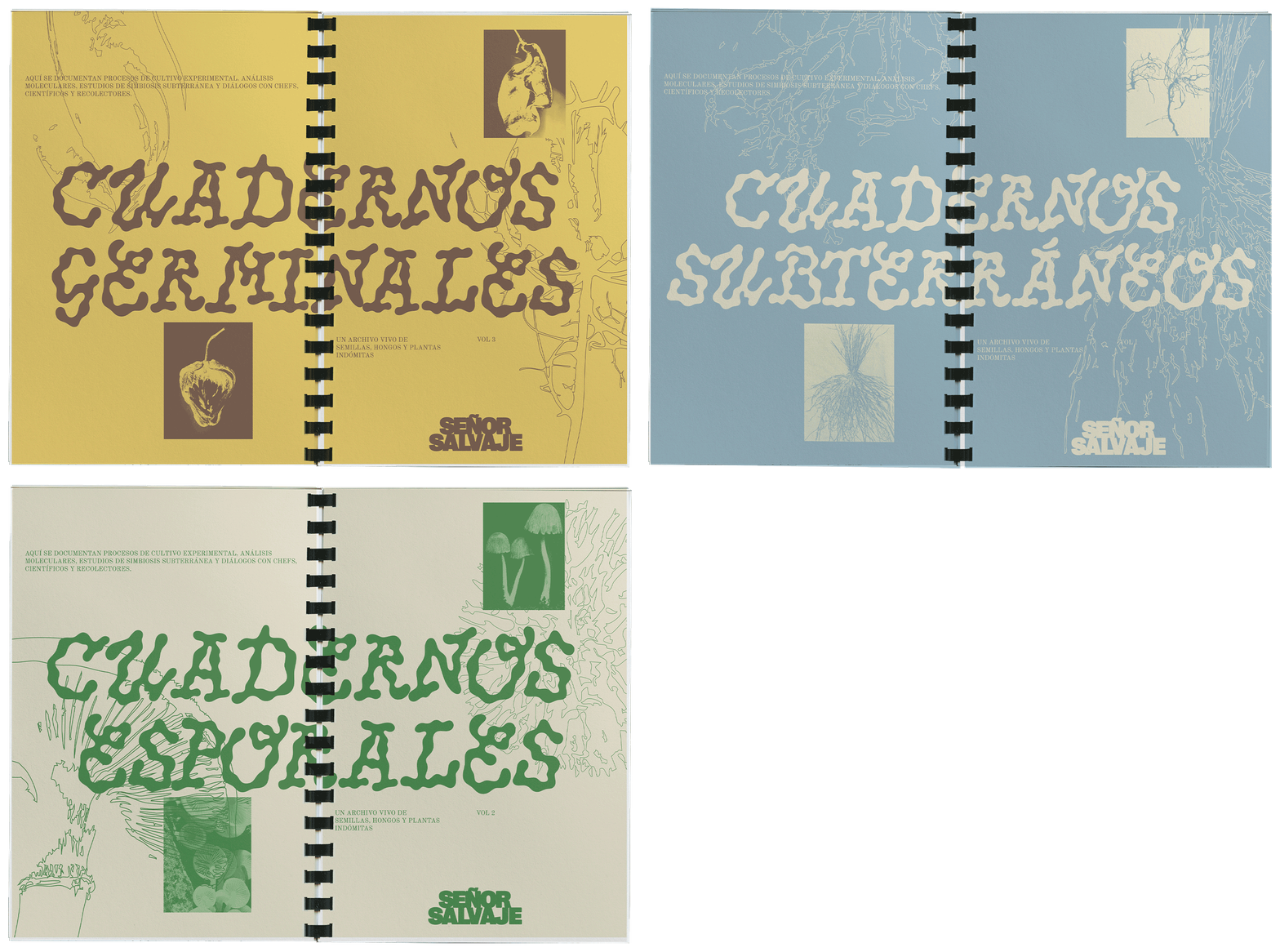
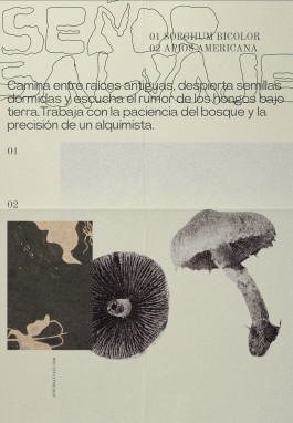
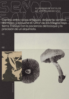
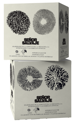
SEÑOR SALVAJE. Valencia, 2025 Corporate Identity, Packaging & Communication + Info & Credits
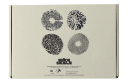
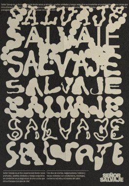
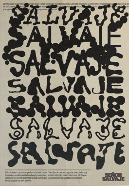
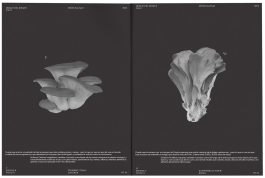
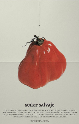
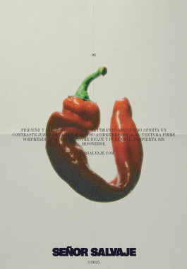
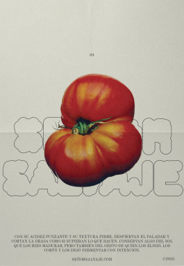
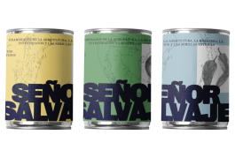
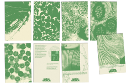
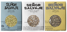
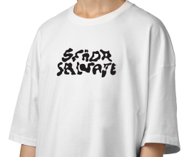
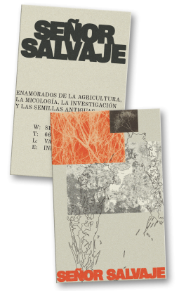
→ Señor Salvaje is an agroecological project driven by a passion for chiles, heirloom seeds, and rural life. Its name balances tradition and respect (Señor) with freedom and connection to nature (Salvaje).
The brand revives forgotten flavors and connects nature, culture, and gastronomy with an authentic, instinctive approach.
Concept & Design: Ana García Segura & → Vero Santana








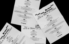
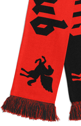
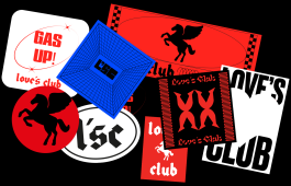
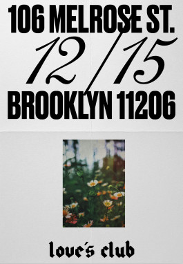
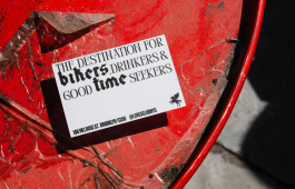
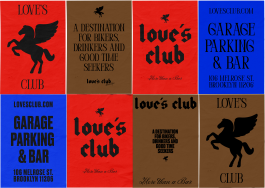
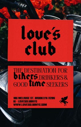
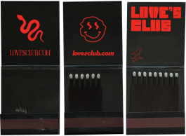
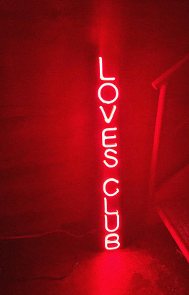
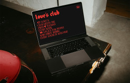
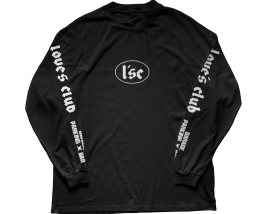
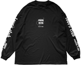
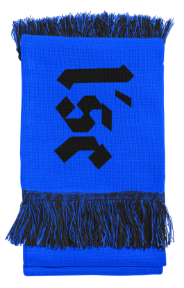
LOVE´S CLUB. NYC, 2024 Corporate Identity & Art Direction + Info & Credits
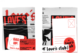
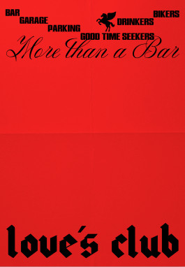
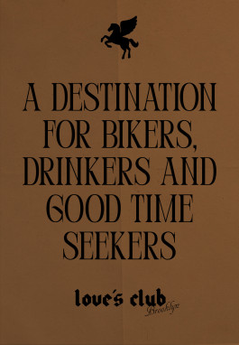
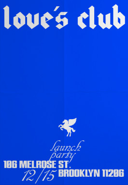
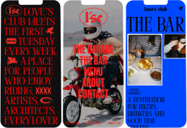
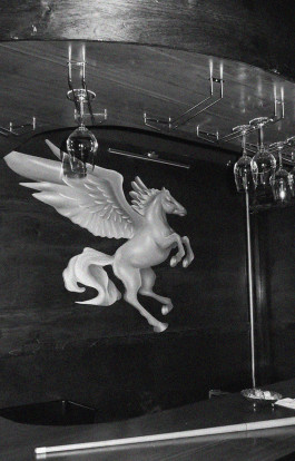
Love’s Club is a motorcycle social club and bar housed in a unique Brooklyn warehouse, blending the raw rebellion of biker culture with classic elegance.
More than a space for riders, it’s an urban refuge for a diverse, creative community where art, music, and authentic lifestyle come together.
Concept & Design: Ana García Segura & → Clara Broseta



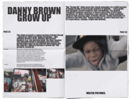
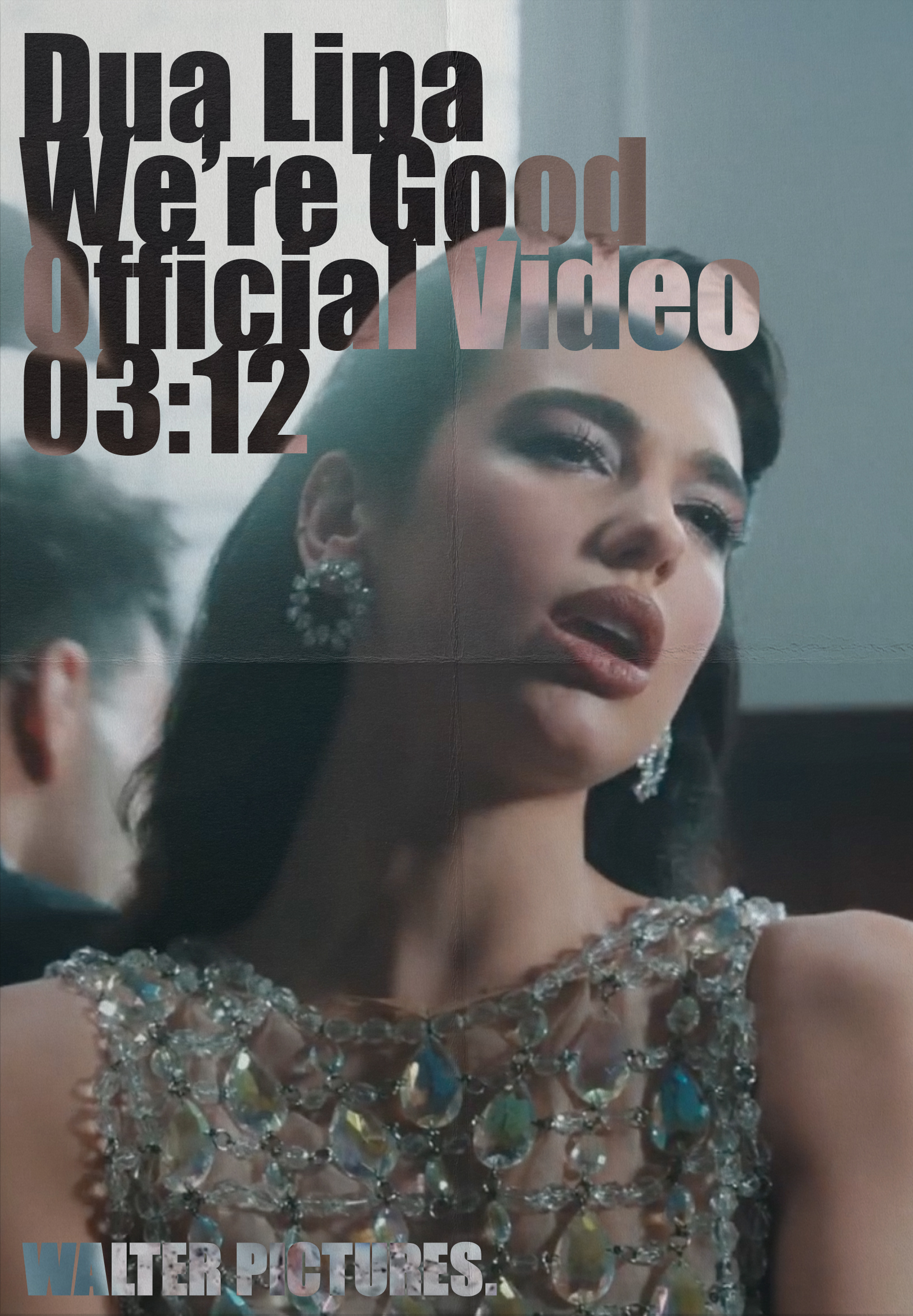
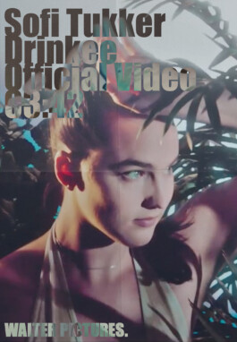
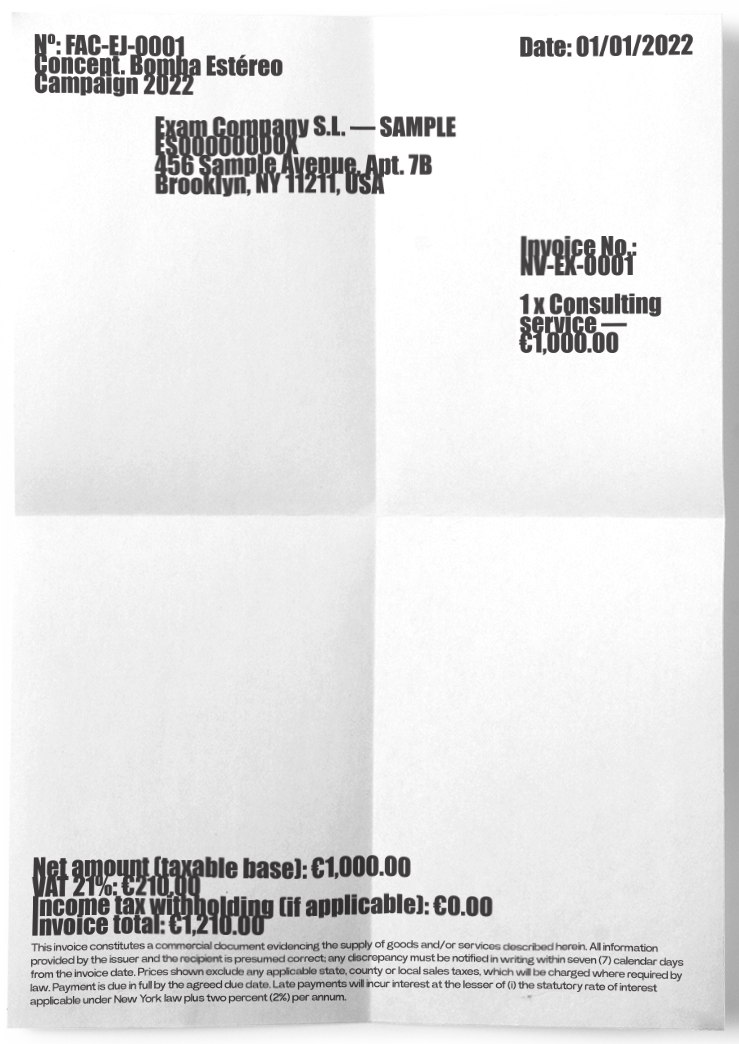
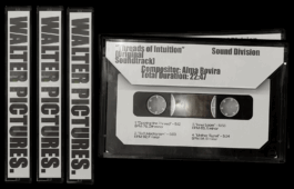
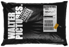
WALTER PICTURES. NYC, 2022 Corporate Identity, Editorial, Website & Communication + Info & Credits
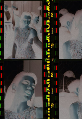
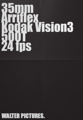
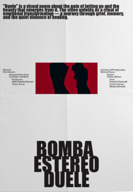
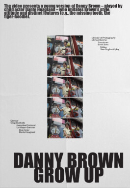
Walter Pictures is an independent New York–based production company creating music videos, commercials, and interactive films for artists like Bob Dylan, Dua Lipa, Bomba Estéreo, Baby Keem or Joji. They’ve been recognized for their award-winning work, including the interactive Like A Rolling Stone video, which earned 4 Gold Lions.
Concept & Design: Ana García Segura & Merry+ (NYC)

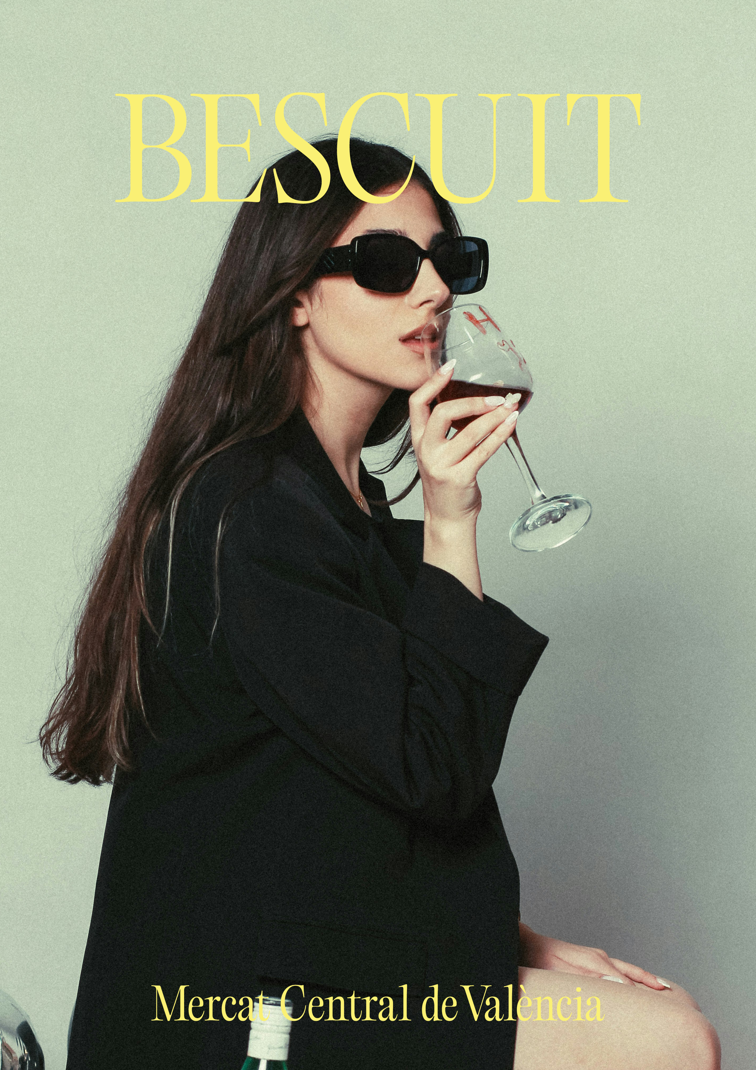
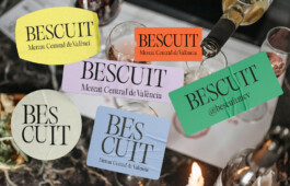
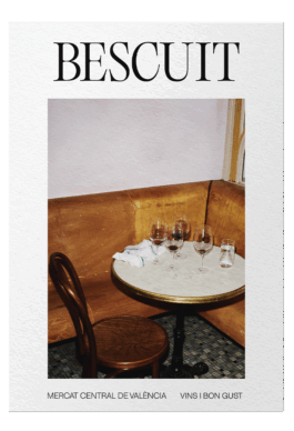
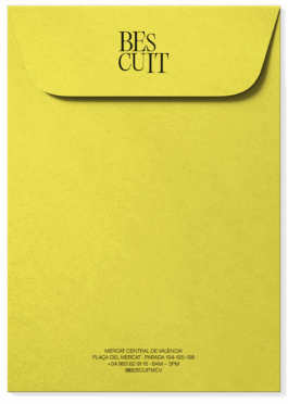
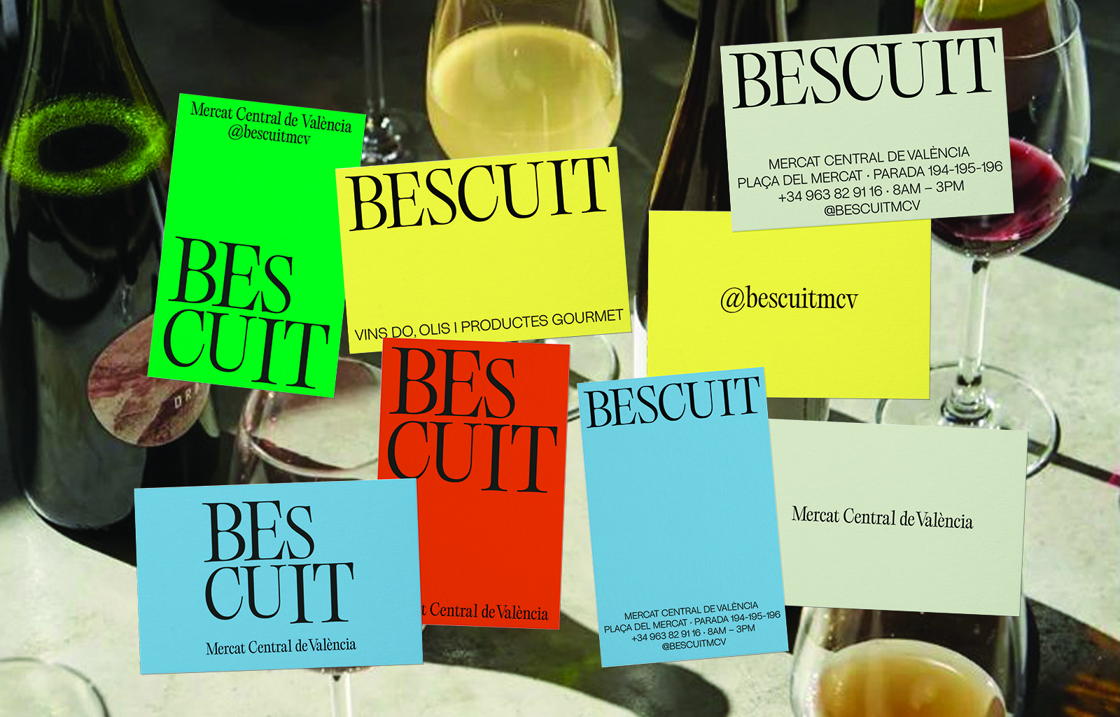
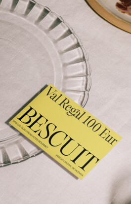
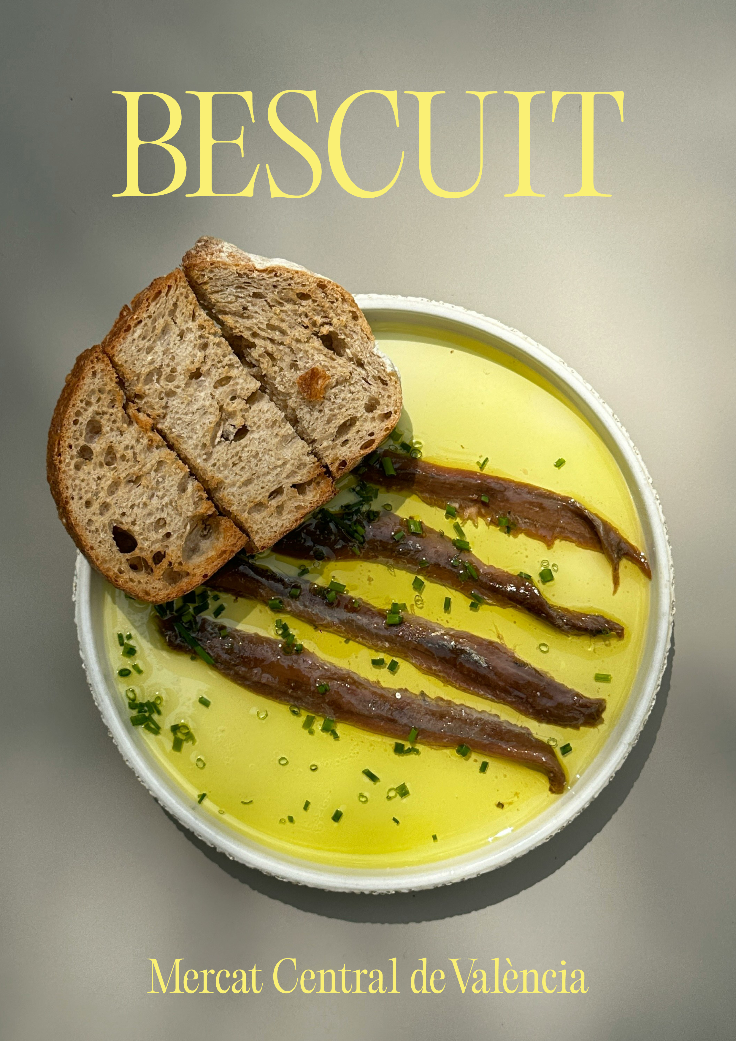
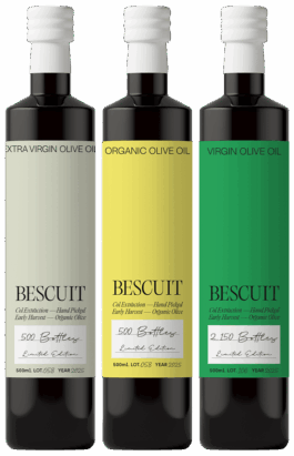
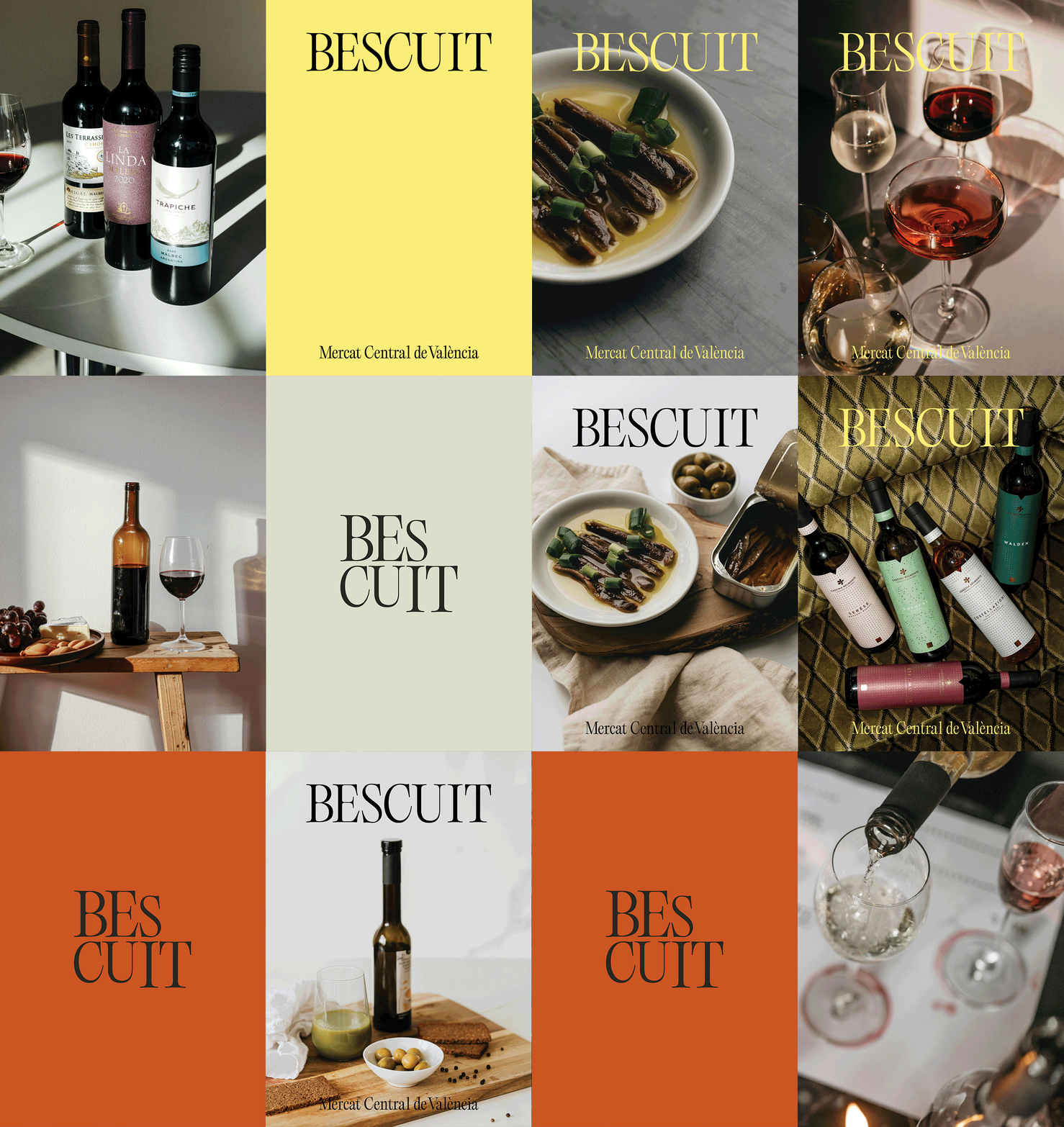
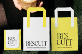
BESCUIT, VINS & OLIVE OILS. Valencia, 2025 Corporate Identity, Packaging & Communication + Info & Credits
Bescuit is a historic stall in Valencia’s Central Market, known for its wide selection of wines from Valencia’s DO regions and high-quality olive oils. The studio developed a new visual identity to enhance the stall’s presence in the market. The design emphasizes light, elegance, and clarity, reflecting the quality and variety of the products while creating a cohesive and visible brand experience.
Concept & Design: Ana García Segura & → Vero Santana


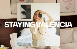
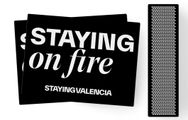
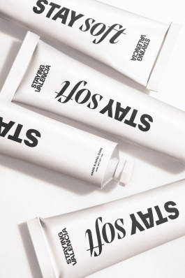
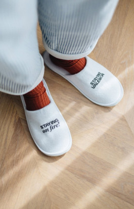
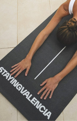
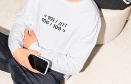
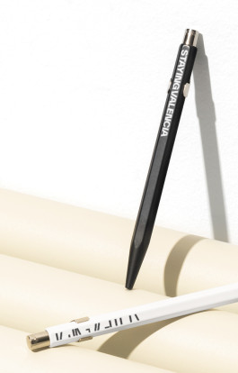
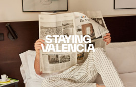
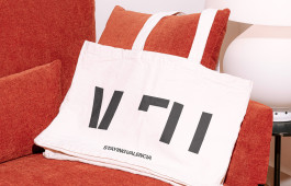
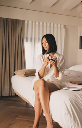
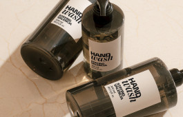
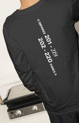
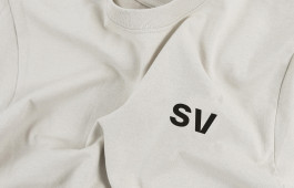
STAYING VALENCIA. Valencia, 2022 Corporate Identity, Packaging, Website & Communication + Info & Credits
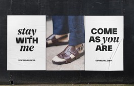
Staying Valencia is a well-established Valencian brand that offers more than just accommodations: it delivers local experiences, design, sustainability, personalized service, and an active digital community. All of this positions the brand as a benchmark for responsible tourism and an authentic way to discover Valencia. Under the umbrella of “Come as you are”, Staying Valencia brings together eleven hotels and tourist apartments, as well as five restaurants, all united by a focus on design, quality, and exclusivity.
Each establishment has its own visual identity tailored to its target audience, from boutique spaces to more functional options, while always maintaining the group's aesthetic and conceptual coherence.
Photography & Media: Staying Valencia

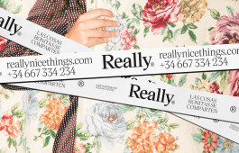
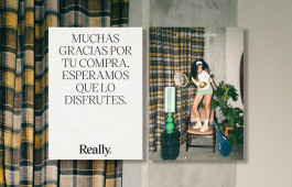
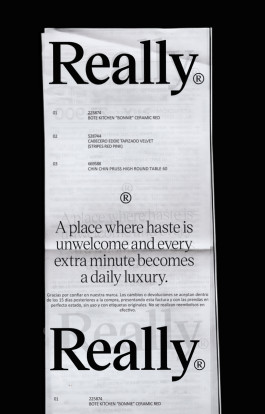
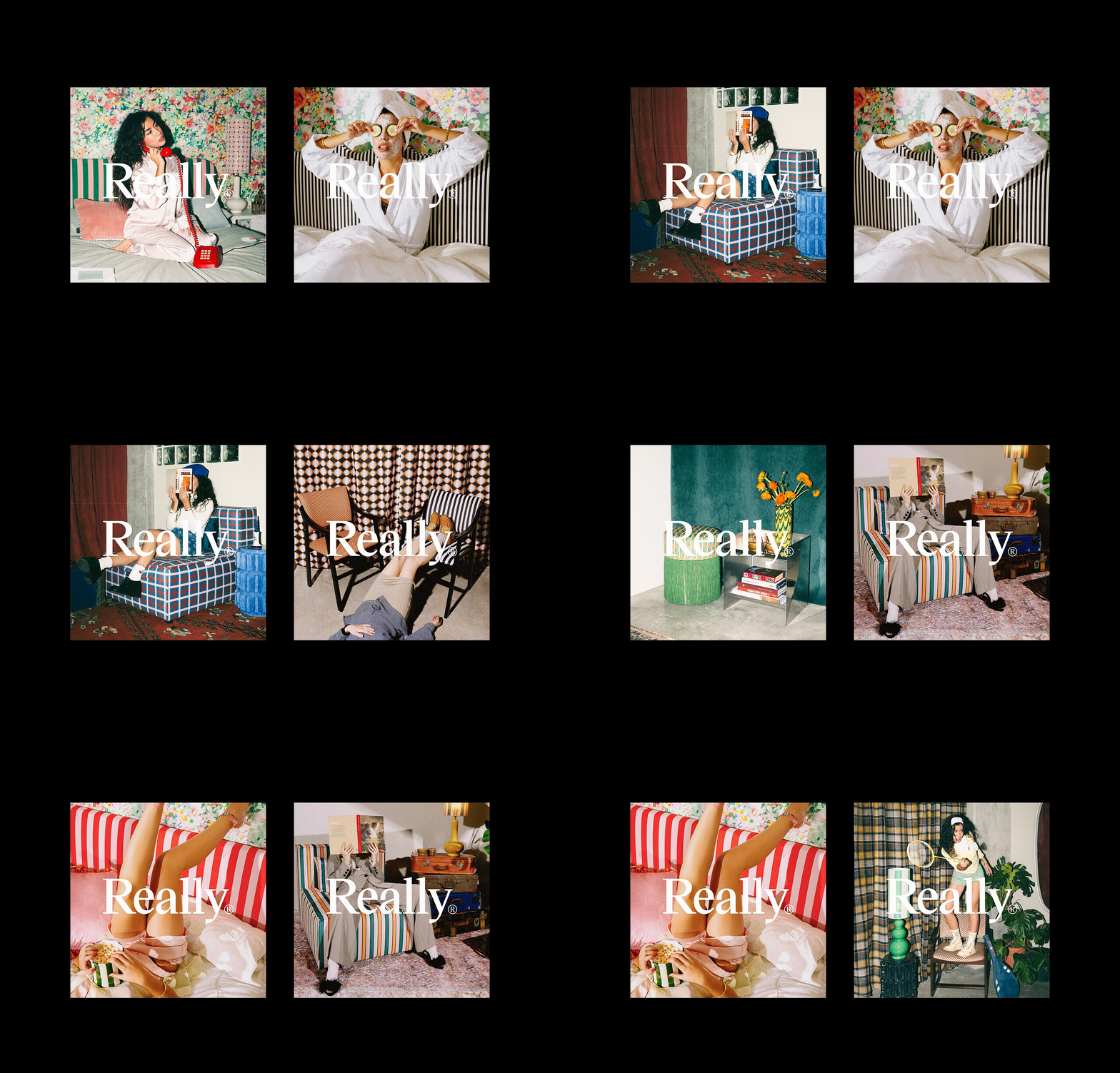
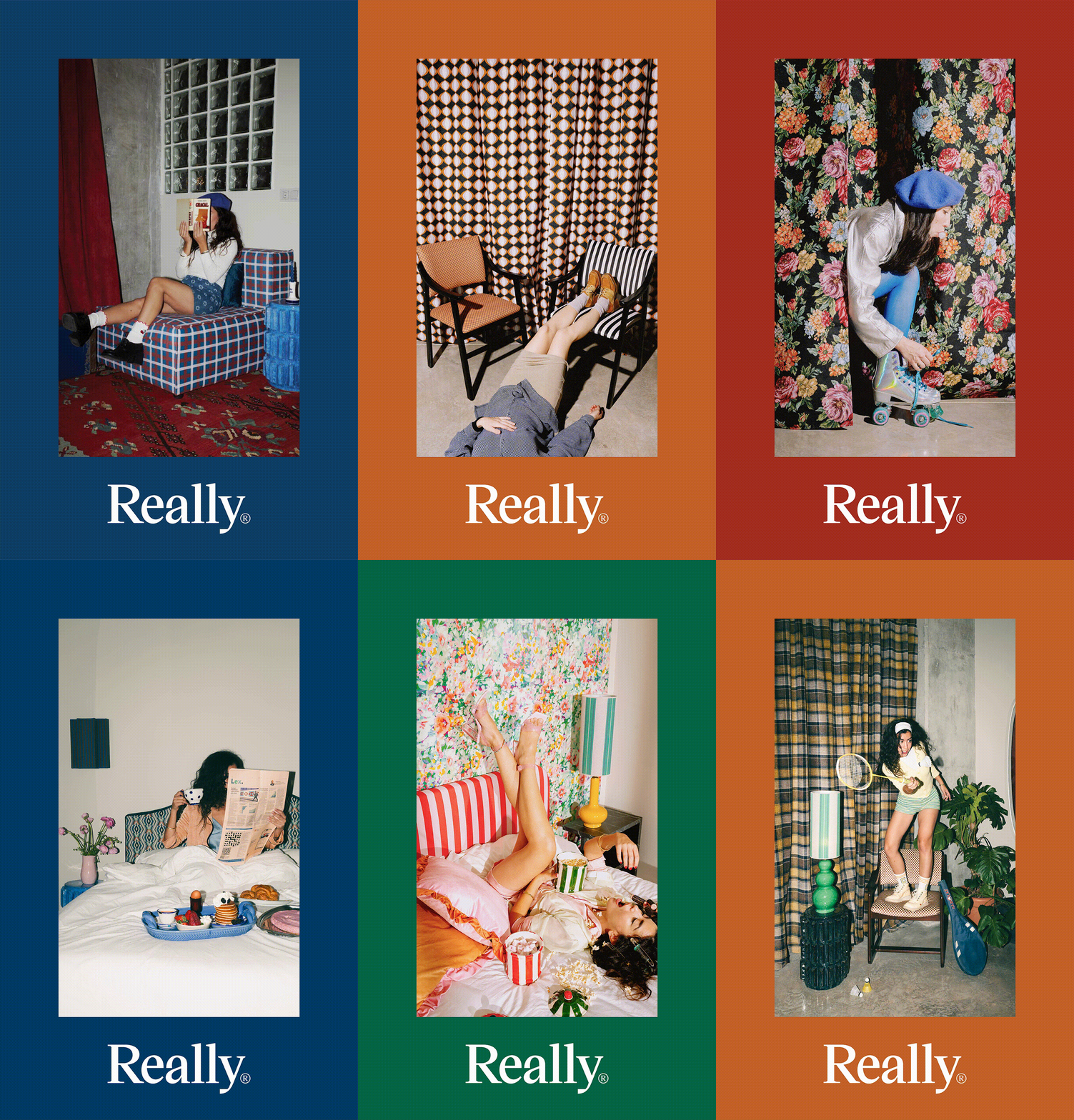
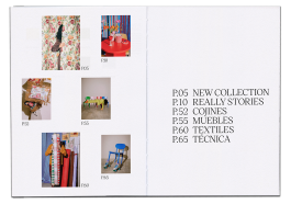
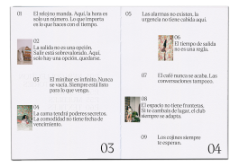
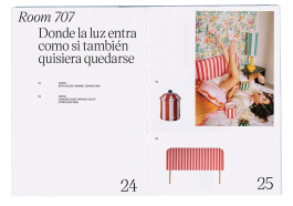
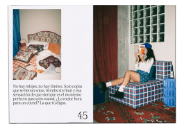
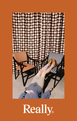
REALLY. VALENCIA, 2025 Corporate Identity, Editorial, Website & Communication + Info & Credits
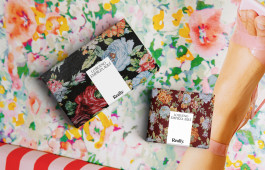
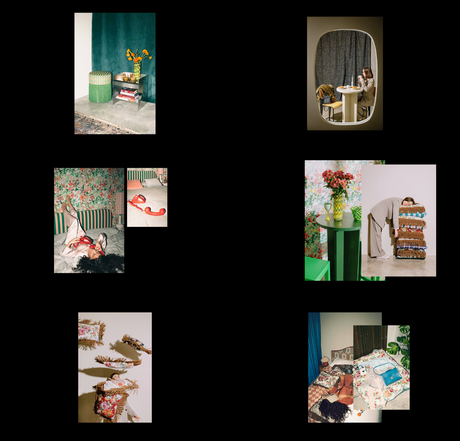
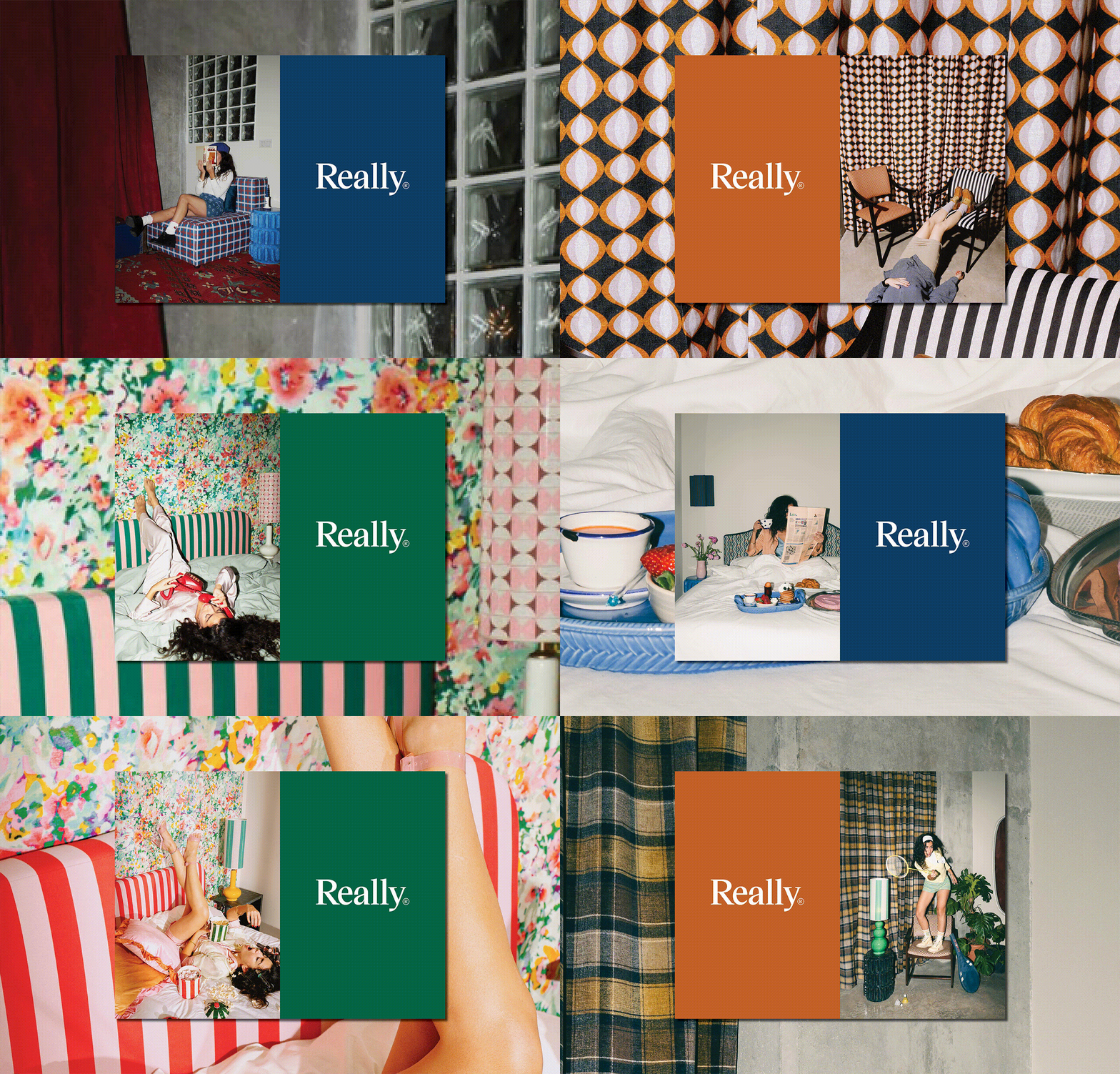
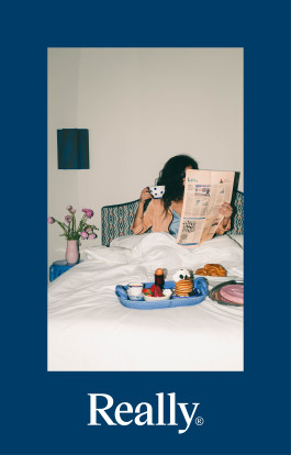
Really’s identity emerges from its origins in local craftsmanship, evolving from “Really Nice Things” into a more refined, conscious brand.
Dedicated to the design and production of stylish home objects, it blends modern aesthetics with the warmth of handmade work, staying true to its creative roots.
Brand Concept & Design: Ana García Segura & → Vero Santana
Art direction and Set Design: Really & → Carolina Micó
Photography: Luis Beltrán & Filtro




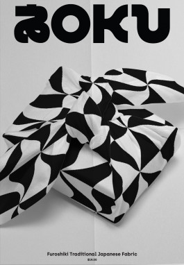
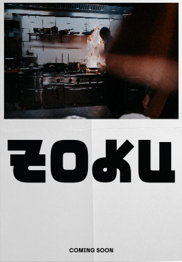
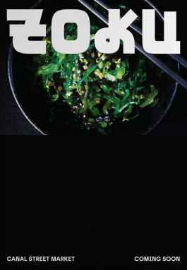
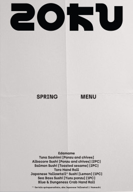
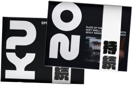
ZOKU SUSHI. NYC, 2019 Corporate Identity, Concept Direction, Packaging & Communication + Info & Credits
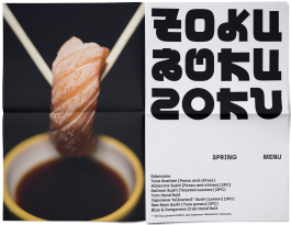
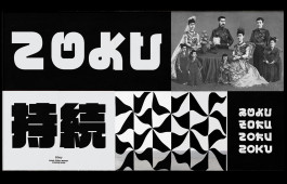
Zoku was born from the need to speak about Japan and its cuisine across past, present, and future.
This temporal vision takes shape through a flexible identity built from three typefaces that interact with each other, generating over 200 logo variations.
The result is a living brand, always in motion, never appearing the same twice. The communication reflects this approach: contemporary, yet attentive to legacy.
Zoku expresses itself through a visual language that blends tradition with experimentation just like Japanese cuisine itself. A brand that looks forward, without forgetting where it comes from.
Concept & Design: Ana García Segura & Israel Pinilla
Photography: → Carles Rodrigo



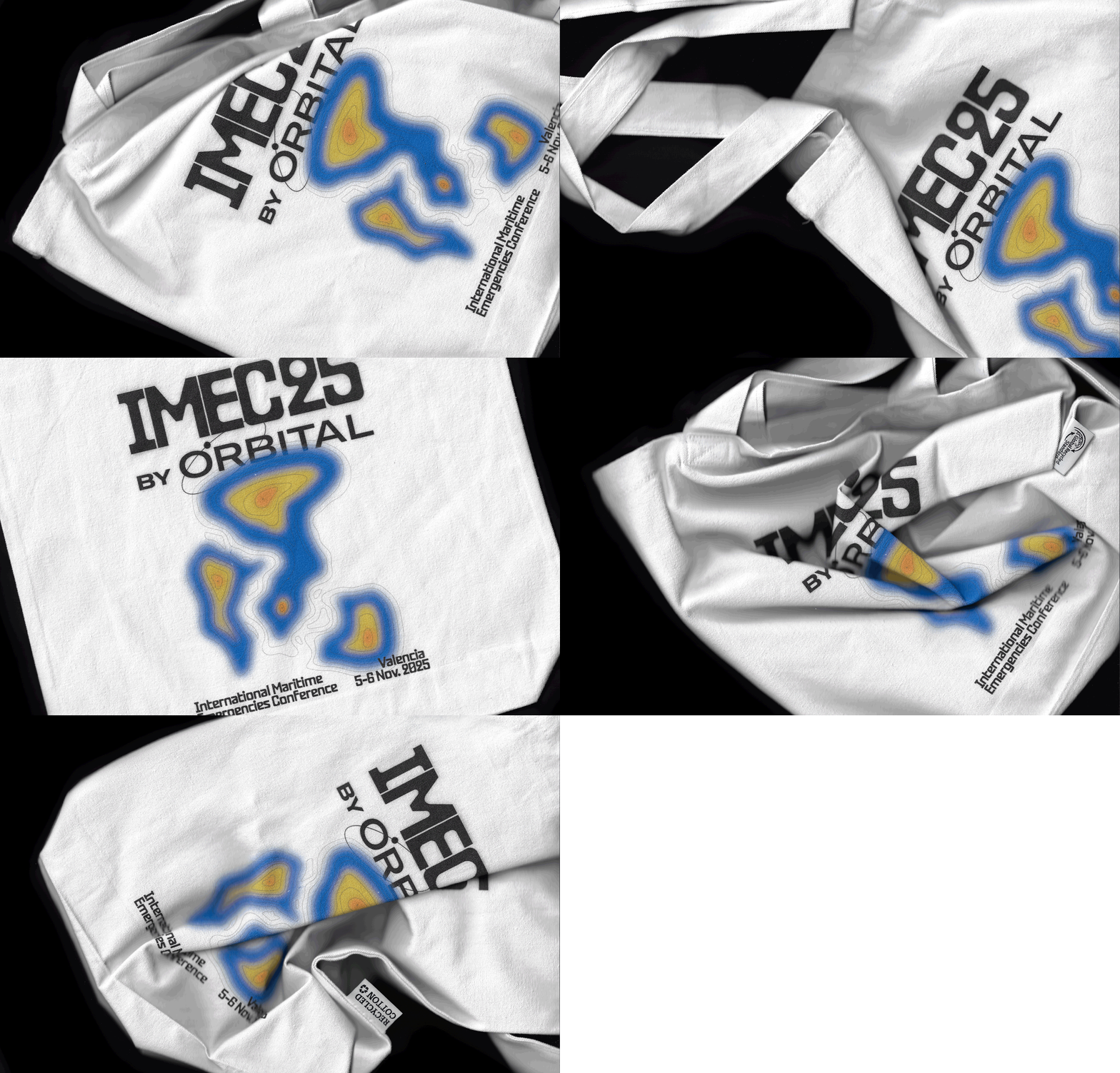
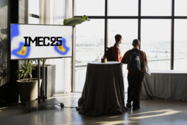
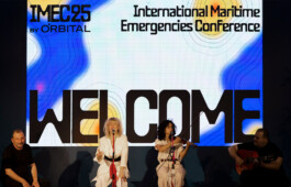
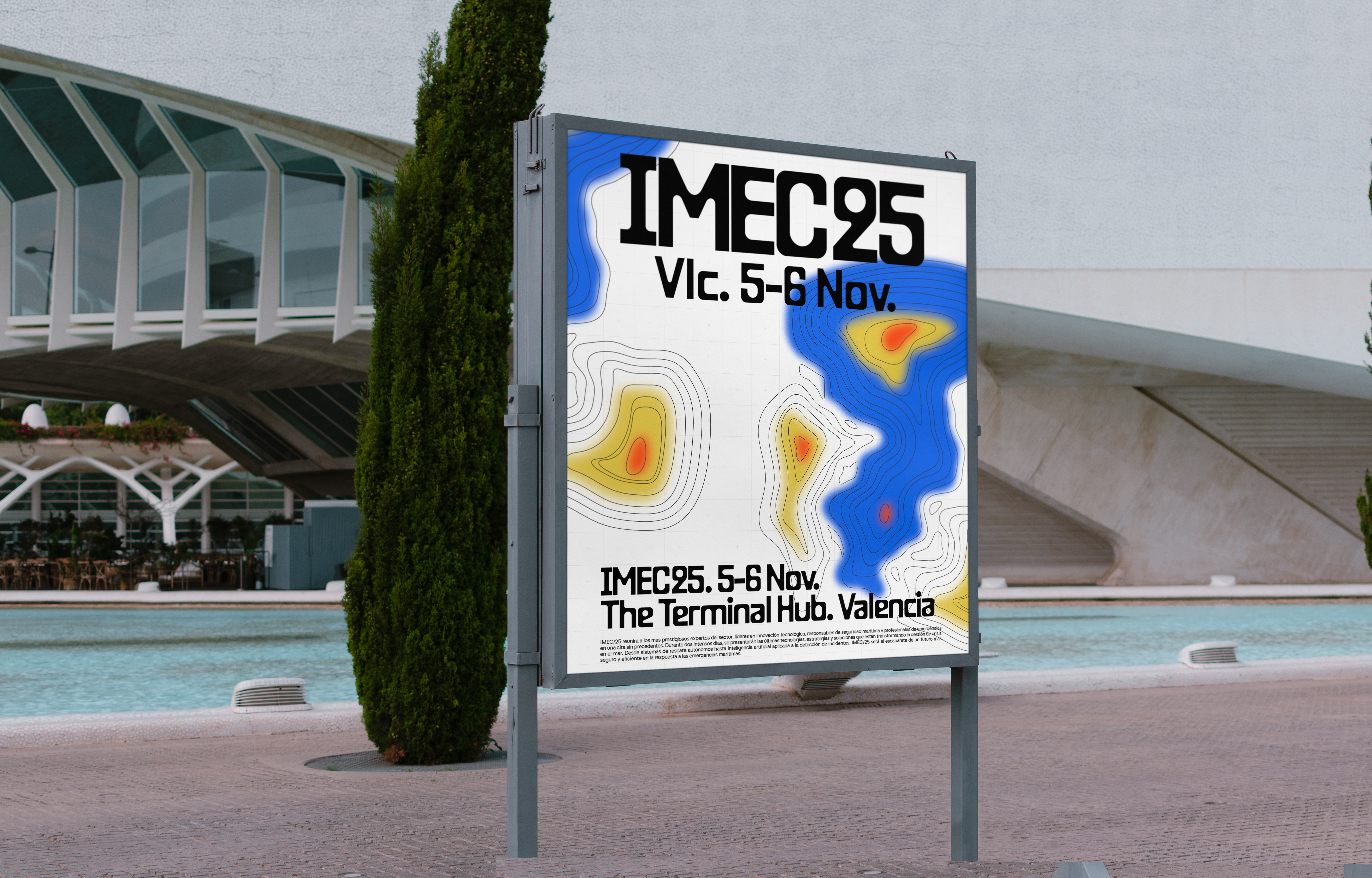
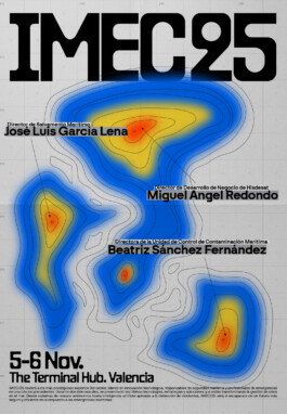
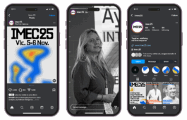
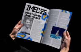
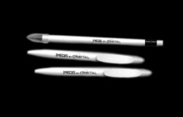
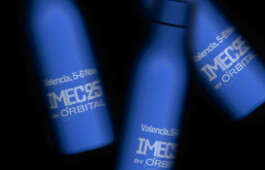
IMEC25. Valencia, 2025 Identity, Graphic Campaign, Conference Displays, Print, Website & Communication + Info & Credits
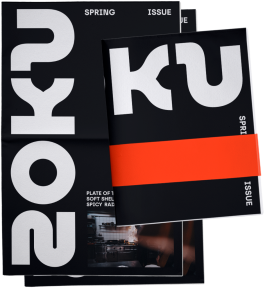
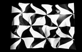
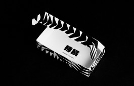
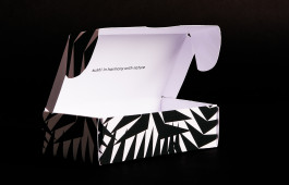
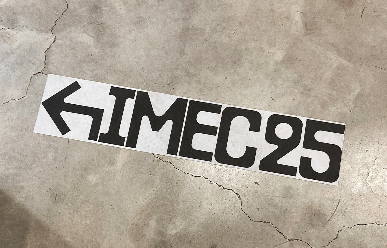
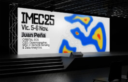
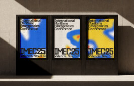
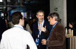
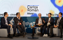
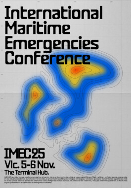
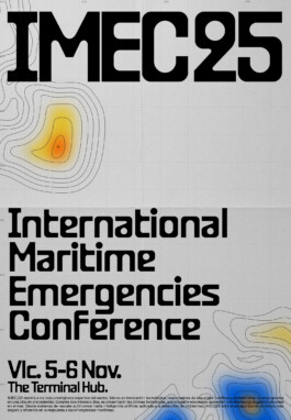
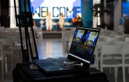
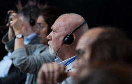
IMEC25 is an international conference on maritime emergencies. The event brings together maritime authorities, environmental experts, rescue professionals, space-tech companies, and researchers to redefine how we respond to crises at sea. The studio created a striking, disruptive visual identity that differentiates it from other sector events. The design emphasizes movement and energy, giving the brand a fresh, dynamic presence. Its impactful, even brutalist, approach conveys strength and innovation, reflecting the intensity and ambition of the conference.
Concept & Design: Ana García Segura & → Vero Santana
Photography: → Pablo Chacón

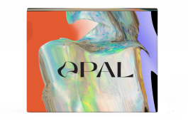
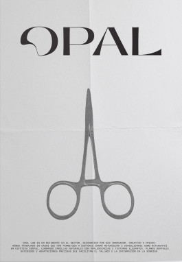
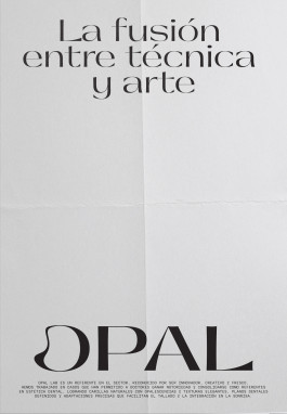
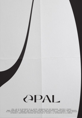
OPAL LAB. VALENCIA, 2025 Corporate Identity, Concept Direction, Packaging & Web Desing + Info & Credits
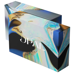
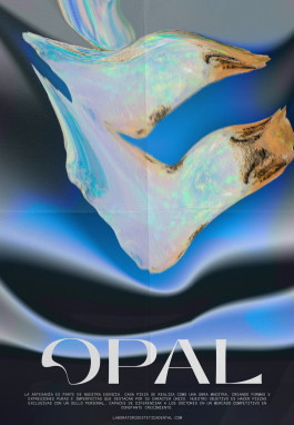
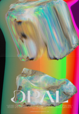
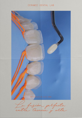
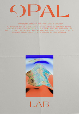
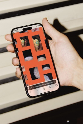
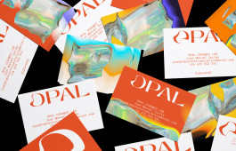
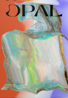
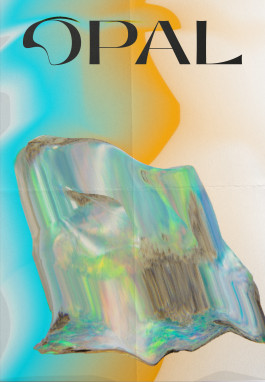
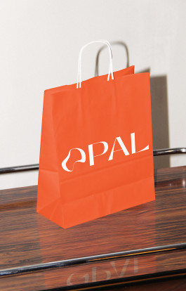
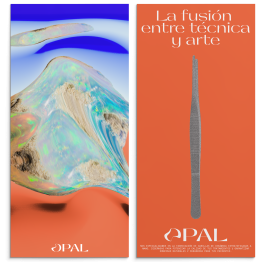
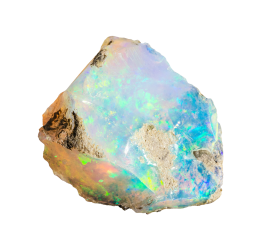
Opal Lab is a handcrafted veneer laboratory. The Identity is inspired by its name, the opal stone, fluid, luminous, and ever-changing. Its logo moves and mutates, echoing the organic, aqueous, and amorphous nature of the mineral. Each piece is shaped by hand, celebrating imperfection as beauty and individuality as art. The brand embodies a living balance between science and emotion, precision and fluidity. Opal Lab transforms craftsmanship into a visual language of light, texture, and transformation.
Concept & Design: Ana García Segura, → Cristina Bonora & → Vero Santana

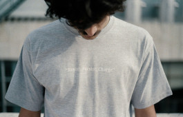
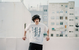
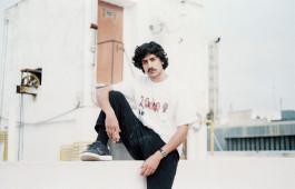
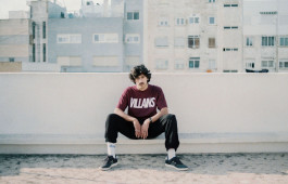
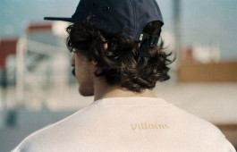
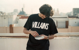
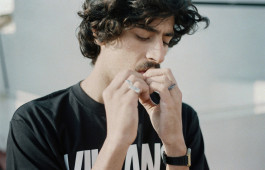
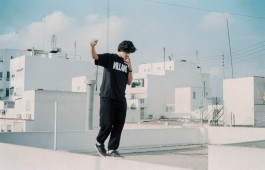
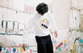
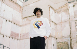
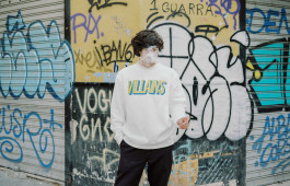
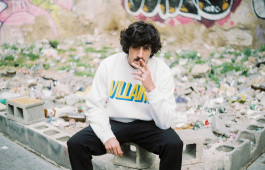
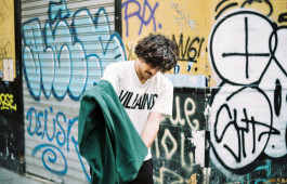
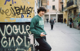
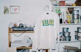
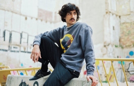
VILLAINS CONSPIRACY. Valencia, 2019 Communication, Collection Design, & Art Direction for the FW18 Campaign + Info & Credits
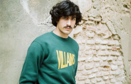
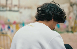
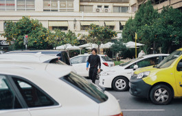
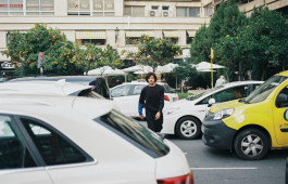
The FW19 collection of Villains Conspiracy perfectly captures its dark and provocative identity, blending streetwear with the essence of 90s skate culture.
Featuring a palette of muted tones with bold contrasts, urban graphics, and aggressive typography, it conveys a rebellious and authentic attitude. Each piece is designed as a statement bold, street-driven, and true to the brand’s philosophy.
Concept & Design: Ana García Segura & Israel Pinilla
Model: Lucas Amador
Photography: → Carmen Gray








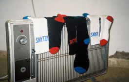
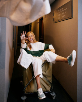
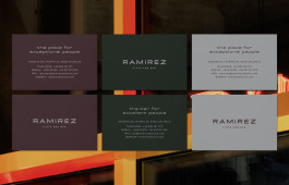
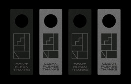
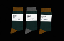
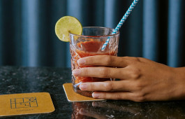
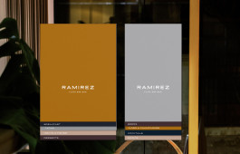
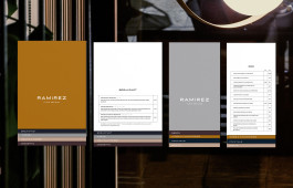
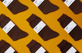
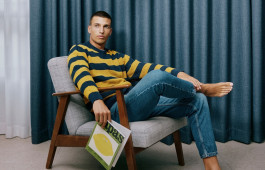
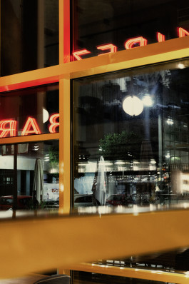
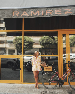
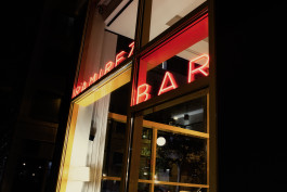
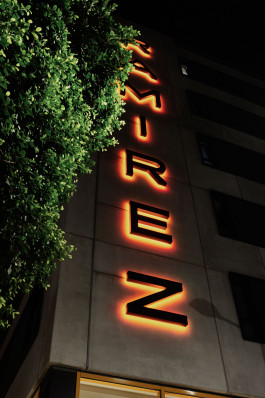
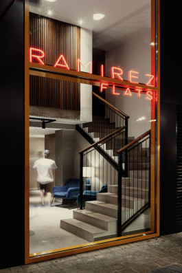
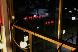
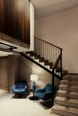
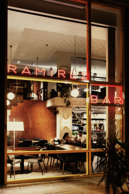
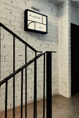
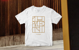
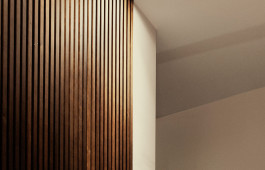
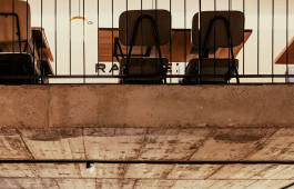
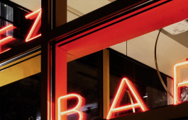
RAMIREZ FLATS & BAR. Valencia, 2019 Corporate Identity, Amenities, Signage, Website & Communication + Info & Credits
Ramirez Flats & Bar presents a modern, urban identity built around comfort, style, and functionality.
With a minimalist design language, neutral tones, and a cozy yet sleek visual experience, it creates a home-like atmosphere tailored for smart travelers.
The brand’s coherence across interiors, graphics, and service reinforces its message: designed living with the warmth of home.
Concept & Design: Ana García Segura & Israel Pinilla
Photography: Staying Valencia & →Nuria Andrés
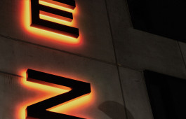
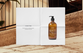
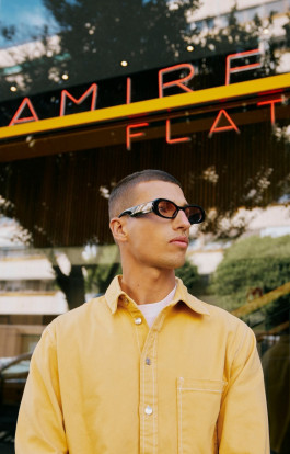
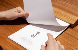
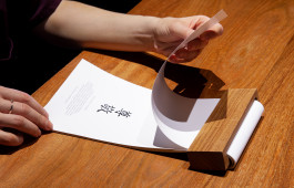
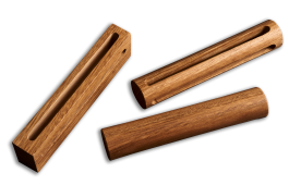
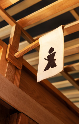
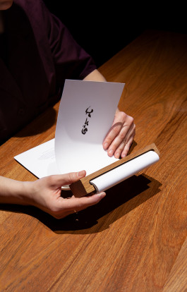
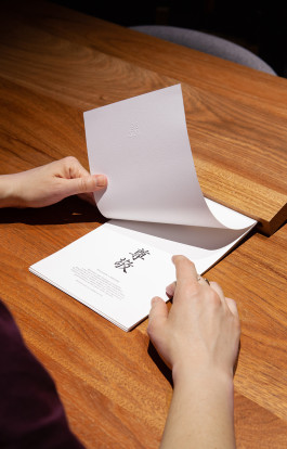
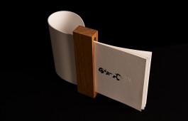
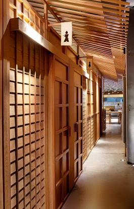
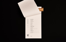
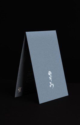
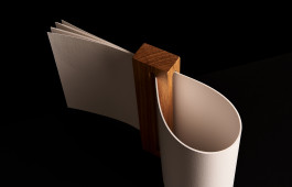
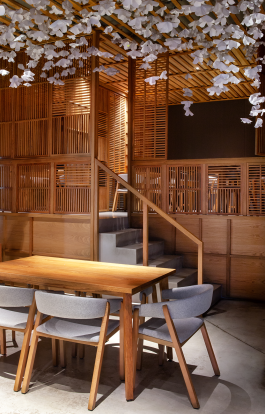
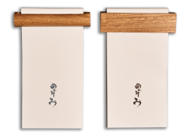
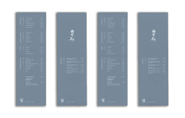
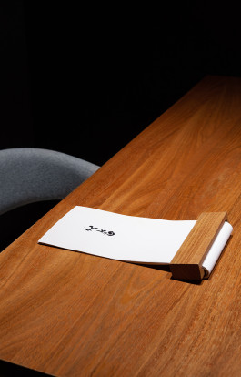
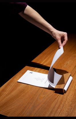
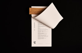
NOZOMI SUSHI BAR. Valencia, 2019 Menu, Table Set Design & Art Direction + Info & Credits
Japanese restaurant Nozomi in Valencia elevates its dining experience with a refined table set, centred around a minimalist, elegant menu.
Inspired by traditional Japanese aesthetics, the design balances simplicity and sophistication, staying true to the restaurant’s identity.
Concept & Design: Ana García Segura & Israel Pinilla
Photography: → Carles Rodrigo & → Nuria Andrés
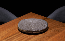
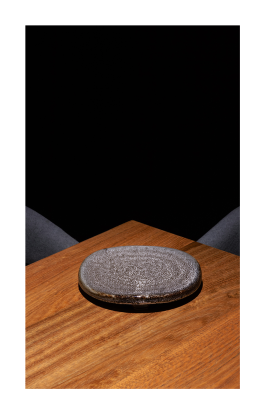
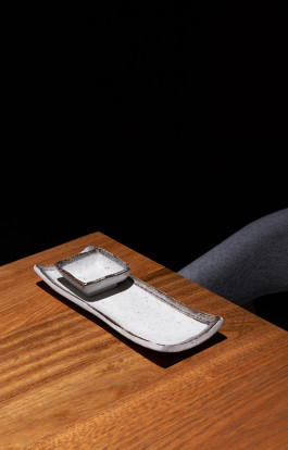
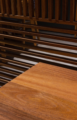
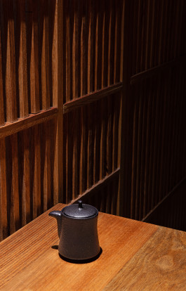
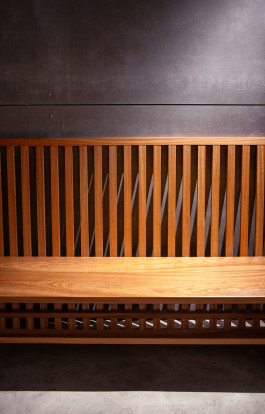
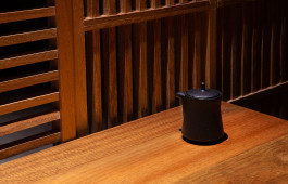
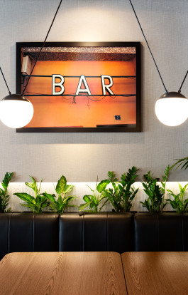
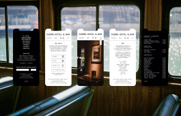
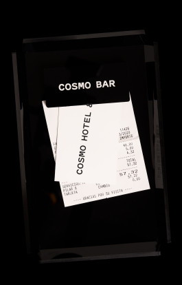
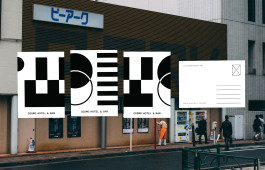
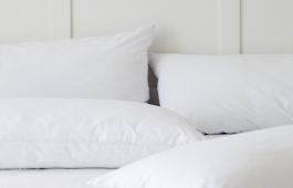
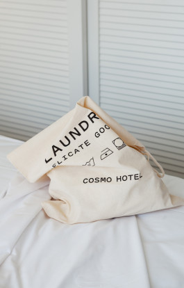
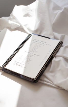
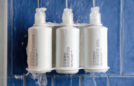
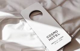
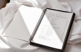
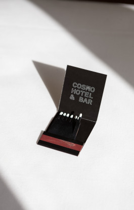
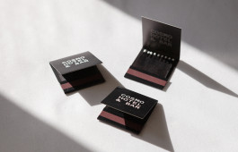
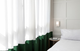
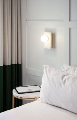
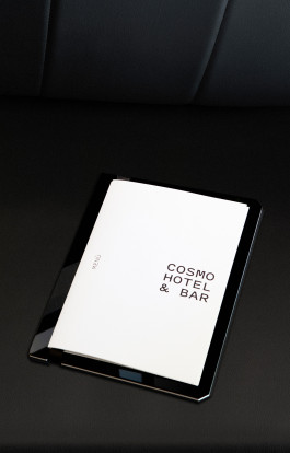
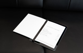
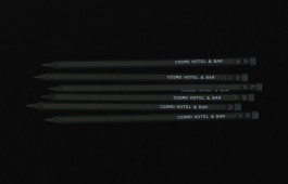
COSMO HOTEL & BAR. Valencia, 2019 Corporate Identity, Amenities, Signage, Website & Communication + Info & Credits
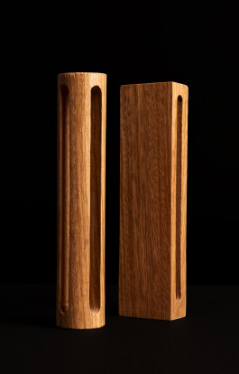
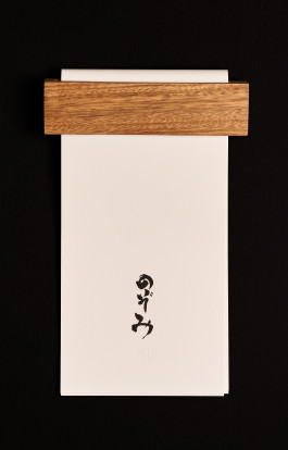
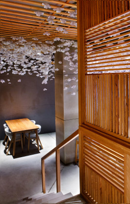
Cosmo Hotel & Bar is built on honest, functional design, with a clear visual identity that extends from signage to digital communication. Everything revolves around one principle: thoughtfully crafted simplicity.
Neutral materials, clean typography, and direct messaging create a cohesive experience both in physical spaces and online. The concept is contemporary, approachable, and straightforward.
We have used modern, industrial-inspired materials, and each element has been carefully designed to align perfectly with the typography and overall concept.
Concept & Design: Ana García Segura & Israel Pinilla
Photography: → Carles Rodrigo & → Nuria Andrés
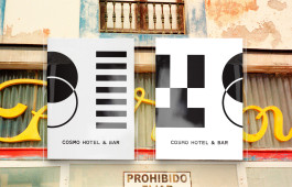
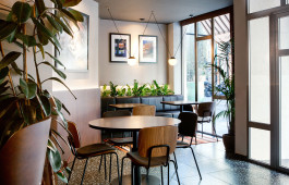
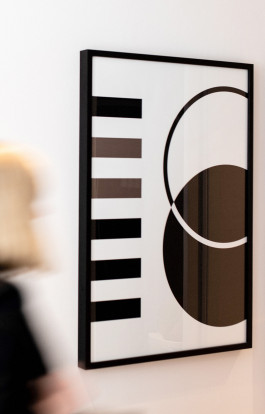
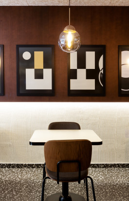
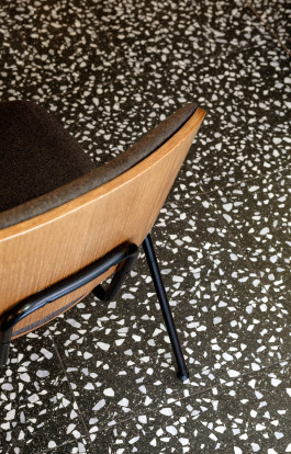
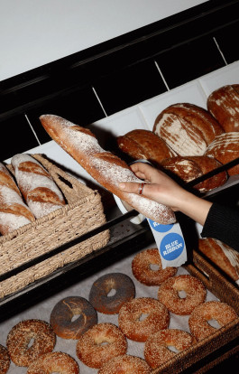
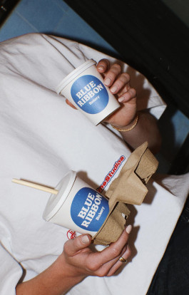
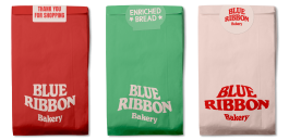
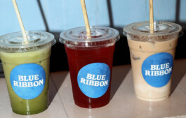
BLUE RIBBON. Marrakesh, 2022 Corporate Identity, Packaging & Communication + Info & Credits
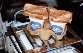
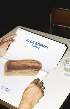
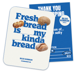
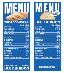
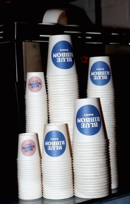
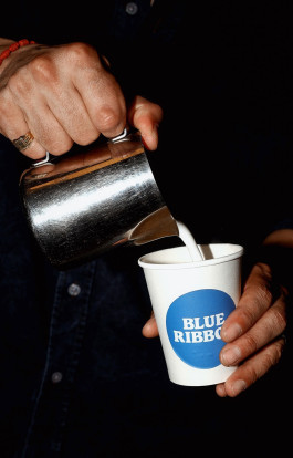
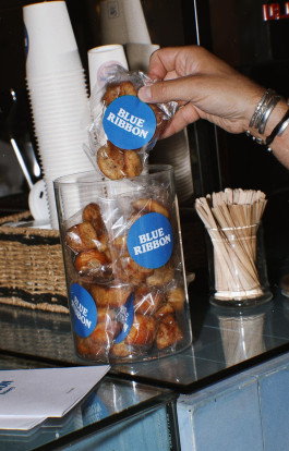
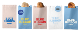
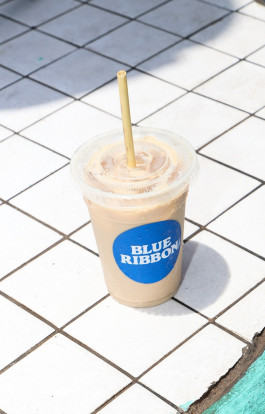
→ Blue Ribbon is a bakery, brunch spot, and café in Marrakech’s Gueliz neighborhood, focused on sustainability and community. The venue sources ingredients from its own permaculture farm, offering artisan pastries, seasonal salads, and carefully brewed coffee. The visual identity reflects this approach, combining modern clarity with touches of American and European retro café style, creating a warm, high-quality, friendly and relaxed atmosphere.
Concept & Design: Ana García Segura & → Clara Broseta
Photography: Blue Ribbon

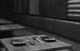
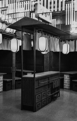
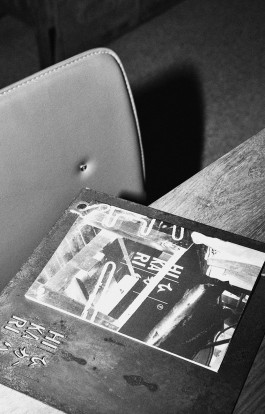
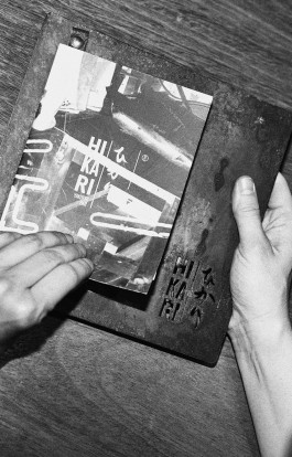
HIKARI YAKITORI BAR. Valencia, 2017 Menu, Table Set Design & Art Direction + Info & Credits
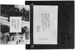
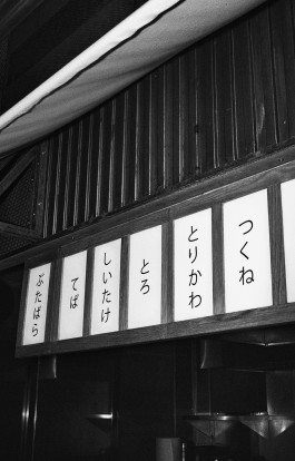
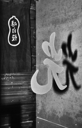
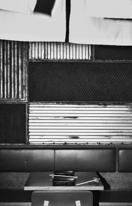
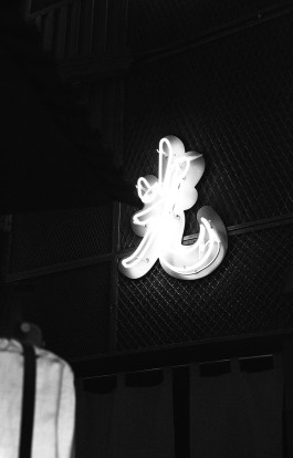
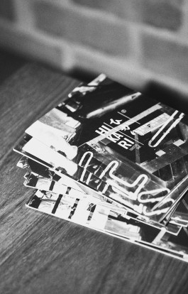
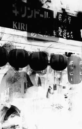
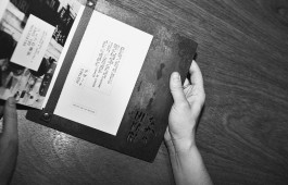
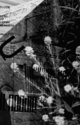
Inspired by Tokyo’s chaotic districts like Kabukicho and Omoide Yokocho, Hikari aligns with Masquespacio’s interior design through materials such as oxidised iron and leather.
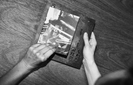
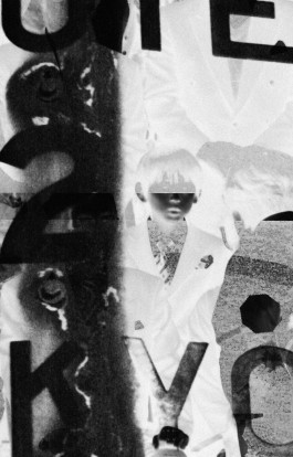
The menu uses a vertical format, black-and-white photography, and layered layouts a nod to Daido Moriyama’s Provoke movement. The table setting is minimal and precise, set against a concept rooted in controlled disorder.
Concept & Design: Ana García Segura & Masquespacio
Photography: → Carles Rodrigo & → Nuria Andrés






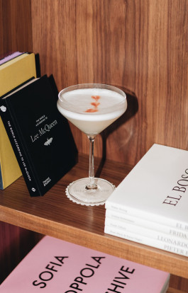
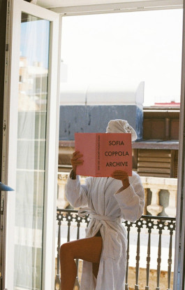
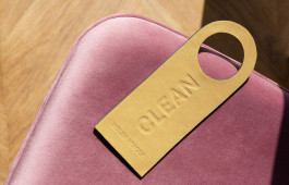
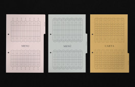
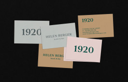
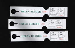
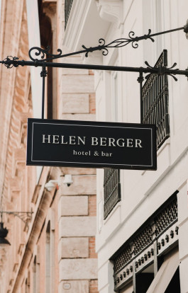
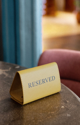
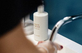
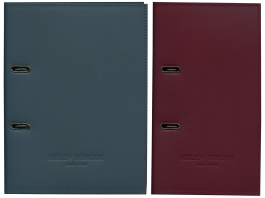
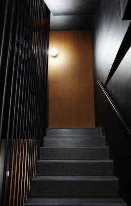
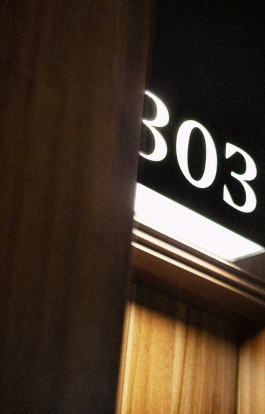
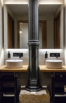
HELEN BERGER. Valencia, 2019 Corporate Identity, Amenities, Signage, Website & Communication + Info & Credits
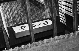
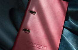
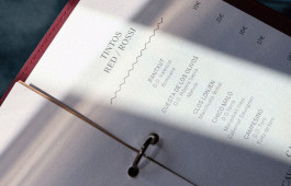
Helen Berger Valencia is a boutique hotel and restaurant housed in a restored modernist building in the historic heart of Valencia.
Opened in 2019, it reflects a sophisticated yet welcoming identity, designed to make guests feel “at home only better.”
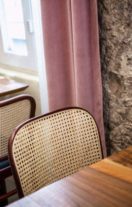
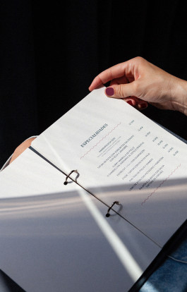
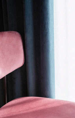
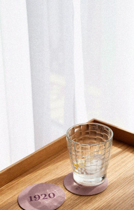
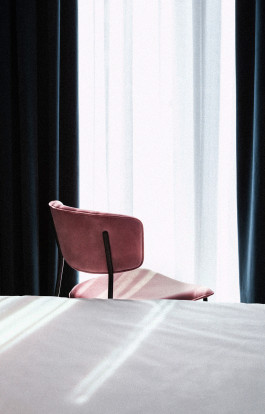
The brand image is built on a soft, elegant aesthetic: neutral tones with touches of dusty pink and blue, natural materials like wood and velvet, and minimalist signage that conveys calm and exclusivity.
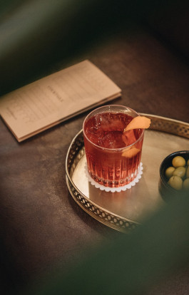
From lighting to plating, every detail is designed with visual and sensory coherence, reinforcing a brand defined by boutique charm, design-conscious elegance, and a focus on comfort and individuality.
Concept & Design: Ana García Segura & Israel Pinilla
Photography: Staying Valencia, → Carles Rodrigo & → Nuria Andrés
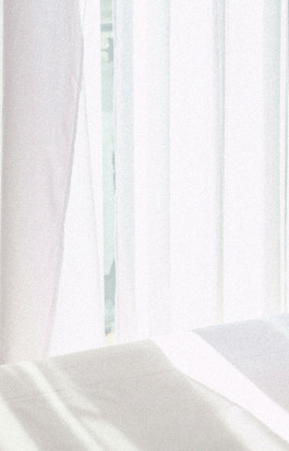
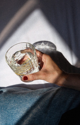
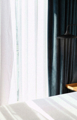
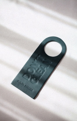
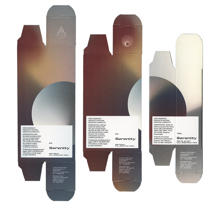
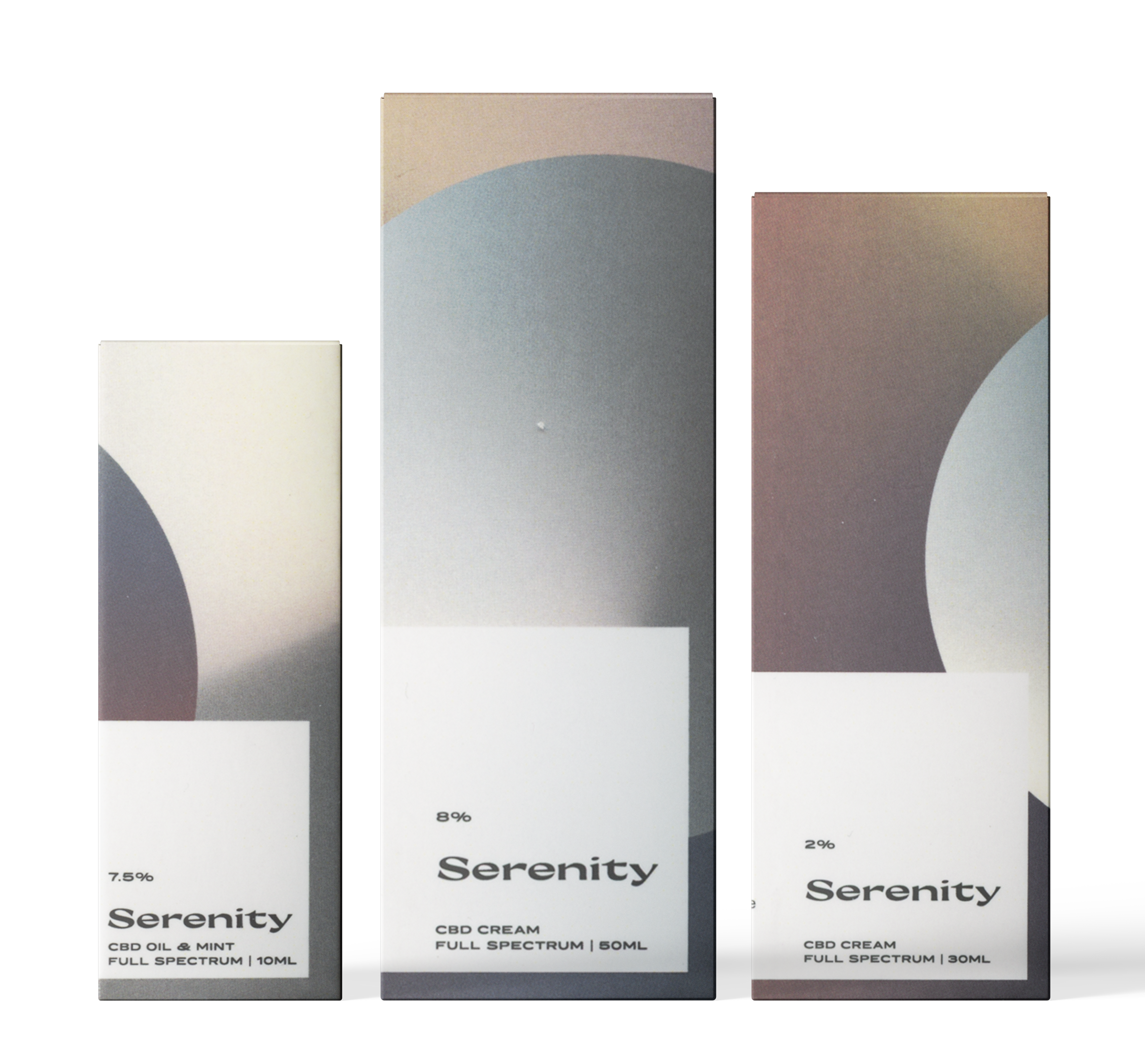
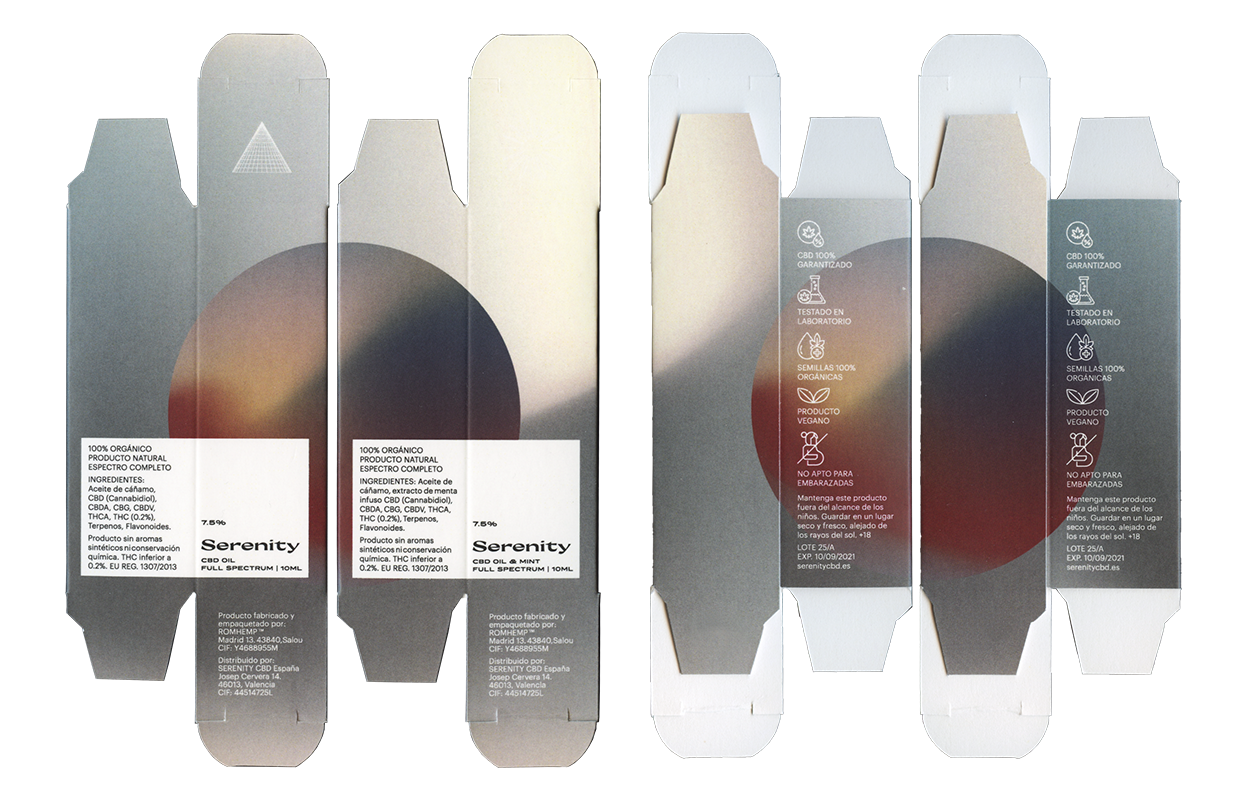
SERENITY. Valencia, 2021 Corporate Identity, Packaging, Art Direction, Website & Communication + Info & Credits
Serenity is a dermatological brand offering oils and creams enriched with cannabidiol (CBD), known for its calming and therapeutic properties. The studio developed a calm and refined visual identity inspired by the slow and rewarding rhythms of nature. The design conveys tranquility, balance, and well-being, reflecting both the restorative qualities of CBD and the soothing experience of the brand.
